Instant Recognition
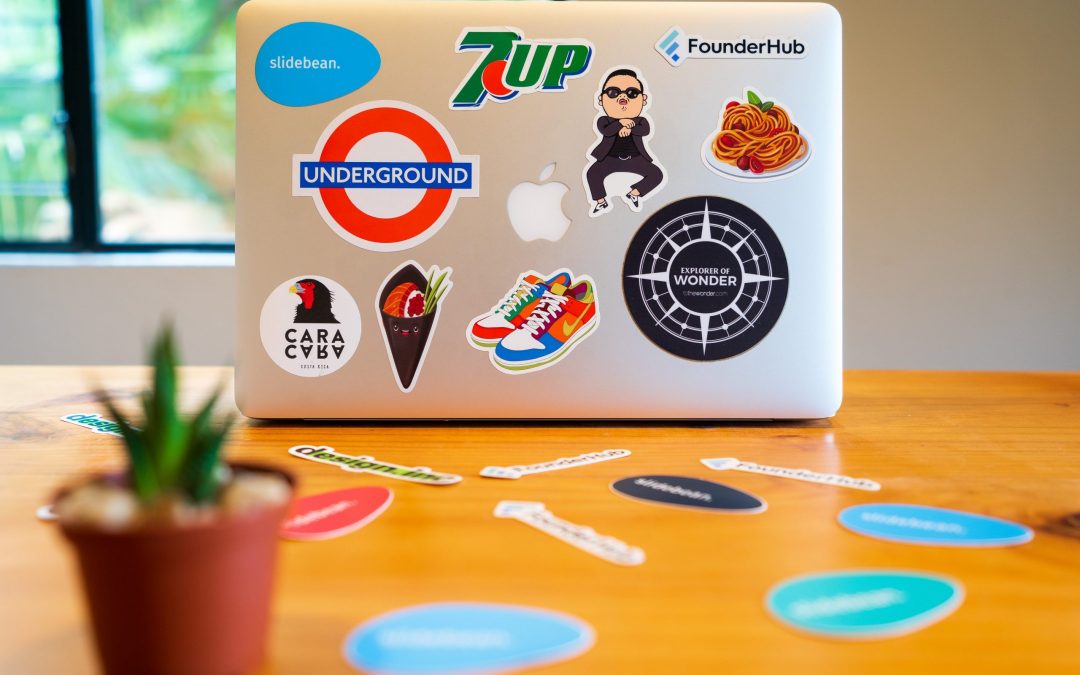
Instant recognition of a company’s identity is the coveted goal of a brand logo. Just ask Apple or McDonald’s. A well-designed logo creates immediate, accurate, and positive communication with the target audience. Simple, clever logos are the most memorable and effective.
Three Fundamental Elements
Achieving impactful simplicity is based on finding the right balance of three critical design elements. Understanding the psychology of color, shape, and typography is essential to designing a powerful logo.
Effective use of these three components signals the unconscious to trigger the desired emotional response. The reaction imprints on memory and generates sudden recall upon visual recognition. BINGO – you’ve designed a winner.
Color is Key
The emotional and psychological effects of color have been well researched and studied. While the descriptive terms may vary, they are largely synonymous, and the conclusions are universal. Here’s a quick sample, worth further exploration into the nuances of hues, tones, tints, and shades:
- Red: excitement, youthful, bold (reputed to stimulate appetite)
- Yellow: happiness, clarity, optimism, warmth
- Orange: fun, friendly, cheerful, confident
- Green: peaceful, growth, health
- Blue: trust, dependable, strength
- Purple: creative, imaginative, wise, rebirth
- Gray: calm, balance, neutrality
Think about McDonald’s bright red sign and the M-shaped golden arches. The yellow is happy. The bold red grabs attention and stimulates hungermaking it very difficult to pass by without craving hot, salty McDonald’s fries!
Shapes & Symbols Send A Message
Many logos incorporate simple universal shapes and symbols to help define a company’s identity. Like with color, there is a psychology behind shapes and how they influence brand perception.
Take, for example, the Target logo. Round images are known to send positive emotions, like friendship, unity, and perfection. The classic red bull’s eye symbol immediately informs the customer that they have come to the right place.
While the Target logo is a bold and obvious use of a universal symbol, one of the most successful and even “subliminal” integrations of a symbol into brand identity is found in the FedEx logo.
“The FedEx logo is mostly known for its tricky optical illusion. If you look closely between letters E and X, you’ll spot a white arrow. It stands for speed, accuracy, strive for perfection, and perseverance in achieving goals.” https://www.logaster.com/blog/fedex-logo/
All types and variations of shapes, from bold to elegant, elicit an emotional response. Basic geometric shapes with strong linear symmetrical outlines like squares, rectangles and triangles imply strength, structure, balance, and order. Whereas more organic shapes like curves and abstract imagery suggest pleasure, happiness, motion, and spontaneity.
Rare and prized are the iconic logos of historic brand giants that are identified solely on their uniquely distinctive shape. Apple and Nike top this short list. The Nike swoosh says it all, motion, speed, pleasure, and spontaneity. Just Do It.
Typography Is Critical
You can choose the perfect color and shapes for your logo design and then fall off the cliff when selecting your typeface. Elements like serifs, script, bold, and unique font design communicate very specific emotions. You may like how a particular font looks, but understanding what it is actually “saying” means doing the research.
“Serif fonts can project a sense of tradition and respectability, while sans serif fonts feel crisp and friendly. Script fonts offer the beauty of handwriting, while modern fonts are futuristic.” https://fabrikbrands.com/font-psychology-and-typography-inspiration-in-logo-design/
The above-cited article is an excellent primer in typography psychology. Check it out.
Get it Right The First Time – Research
Establishing brand recognition can take years and a big budget. Start-ups and small businesses do not have the time or money to take risks with branding. A logo is the “face” of your business. Get it right the first time.
Before you design your logo, focus intently on your audience. Identify every aspect of their emotional decision-making process, and then do the research. Researching the psychology of color, shapes and typography can make the difference between success or failure. Just Do It!
At IMC, Interactive Media Consulting, LLC we have a talented, full-time graphic designer who can help make your company’s logo a winner! Contact us today. www.imediaconsult.com
https://www.designcontest.com/blog/color-and-emotion/
https://blog.hubspot.com/agency/psychology-logo-shapes-infographic
https://www.hongkiat.com/blog/symbols-impact-on-logo-design/


